Meet our Head of UI/UX Design, Frederik Čevela. Although the start of his graphic design journey was nowhere near the game industry, Frederik quickly acquired all the skills needed and spearheaded the environment of UI design in the blockchain space. Having had his own clothing brand, Frederik’s roots are closely tied to fashion design, moving on to the world of marketing agencies until he reinvented his career direction and landed on the Web3 game studio.

Over almost two years under our roof, Frederik has imprinted his designer’s touch on numerous projects, from websites and web apps to in-game user interfaces. Thanks to his previous background in (not only) web design, we decided to sit down with Frederik and address the pending topic that resonates with the game development companies - What’s the actual role of a website in the game industry? What are the differences between the websites of traditional games or studios and Web3 game projects?
Hi there! First thing first, how did you get to a graphic design as such?
It dates back to 2016 - 2017; in fact, it was the clothes design that lured me in. I’ve always been into fashion. And when I started my studies at the University of Economics, somehow, I got drawn into fashion design, which comes hand in hand with graphics. That was my introduction to Illustrator and the rest of Adobe software. I’m also closely tied to video production, having been doing videos for some of the local musicians.
I continued my graphic design career in a marketing agency, where I designed anything from digital banners to websites and web apps. It was then that I joined QOPRO Game Studio. I started as a junior, but I quickly worked my way up to the lead of UI/UX design.
Having your UX/UI experience, please, try to specify what’s the role of a website in the game industry.
It might differ per game, but mostly, especially in Web2, there’s no point in having a well-designed web. As you can see for yourself, most of the traditional mainstream games have just a single one-pager, which serves as a funnel landing page rather than a full-fledged presentation of the game. Most of the time, these webs are just mindless scrollers with a few renders placed on it along with some copy in between. That’s it. Play, add to wishlist, or get out - typical website of traditional Web2 game.

What do you think, why is it so?
The gaming industry got devoured by the monopoly of platforms such as Steam, Epic Store, or PlayStation Store. Players go there to look for new games, not the website. This, naturally, undermines the developers’ willingness to invest in the high-end website experience. They’ll rather focus on optimizing the presence of their games on relevant platforms that generate player base and, thus, revenue. No one seems to care about gaming webs anymore.
Web3 appears to go against this trend. What’s the reason?
The main reason I see is a fact that most Web3 games are far from being complete, not seldom, Web3 games are only a few renders accompanied by a fancy video, but the gameplay is nowhere to be found. It’s easier for companies to come up with an appealing website rather than a game that’s ready to be played. In the Web3 world, they put much more emphasis on web presentations because they usually don’t have a product. This way, it’s easier for them to catch the attention of investors to whom they pitch the idea rather than the fully released product.
In Web3, anyone can be an investor, from regular Joe to traditional investors with big bucks. Hence, Web3 projects are trying to pitch anyone who lands on their website.
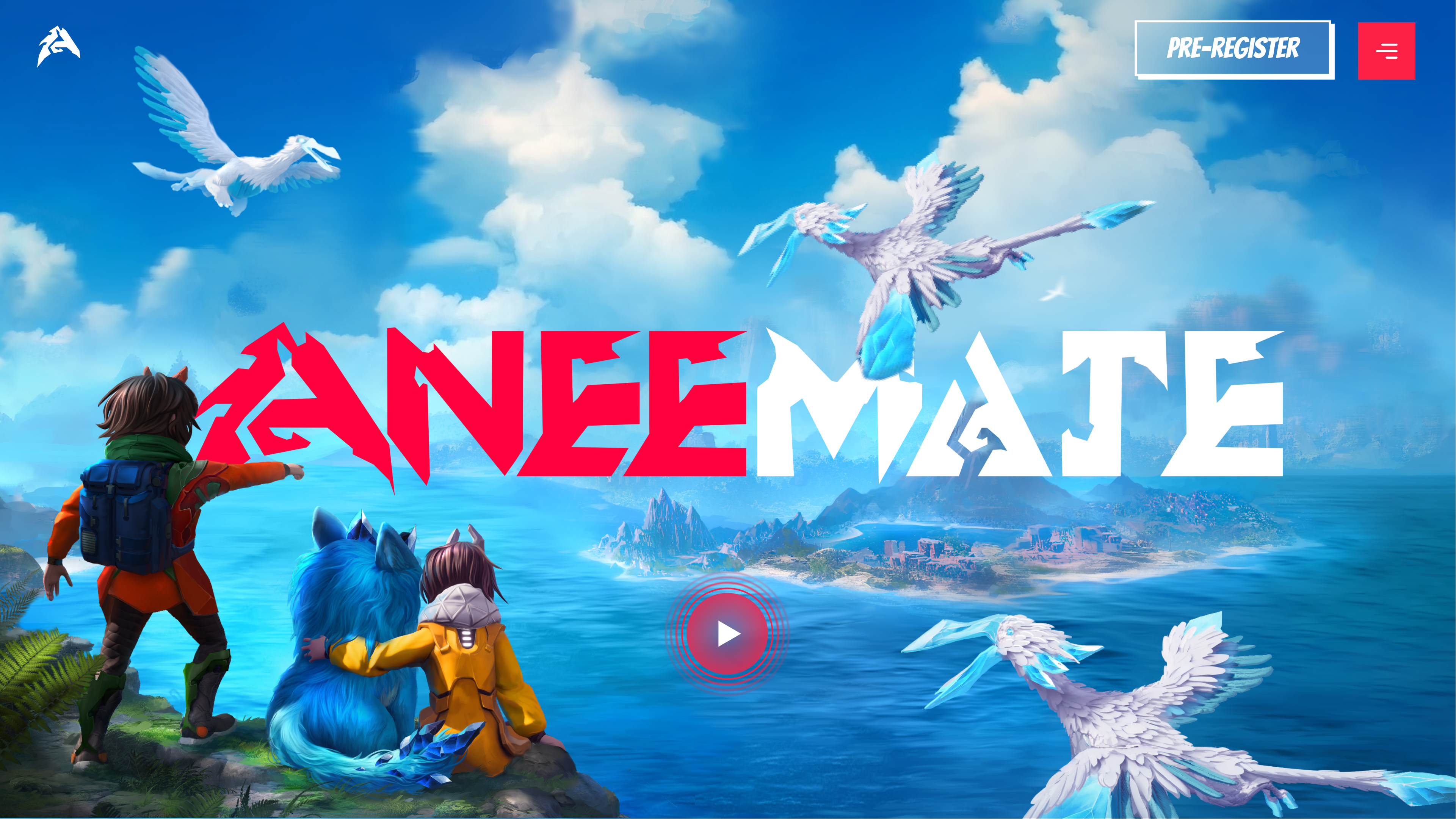
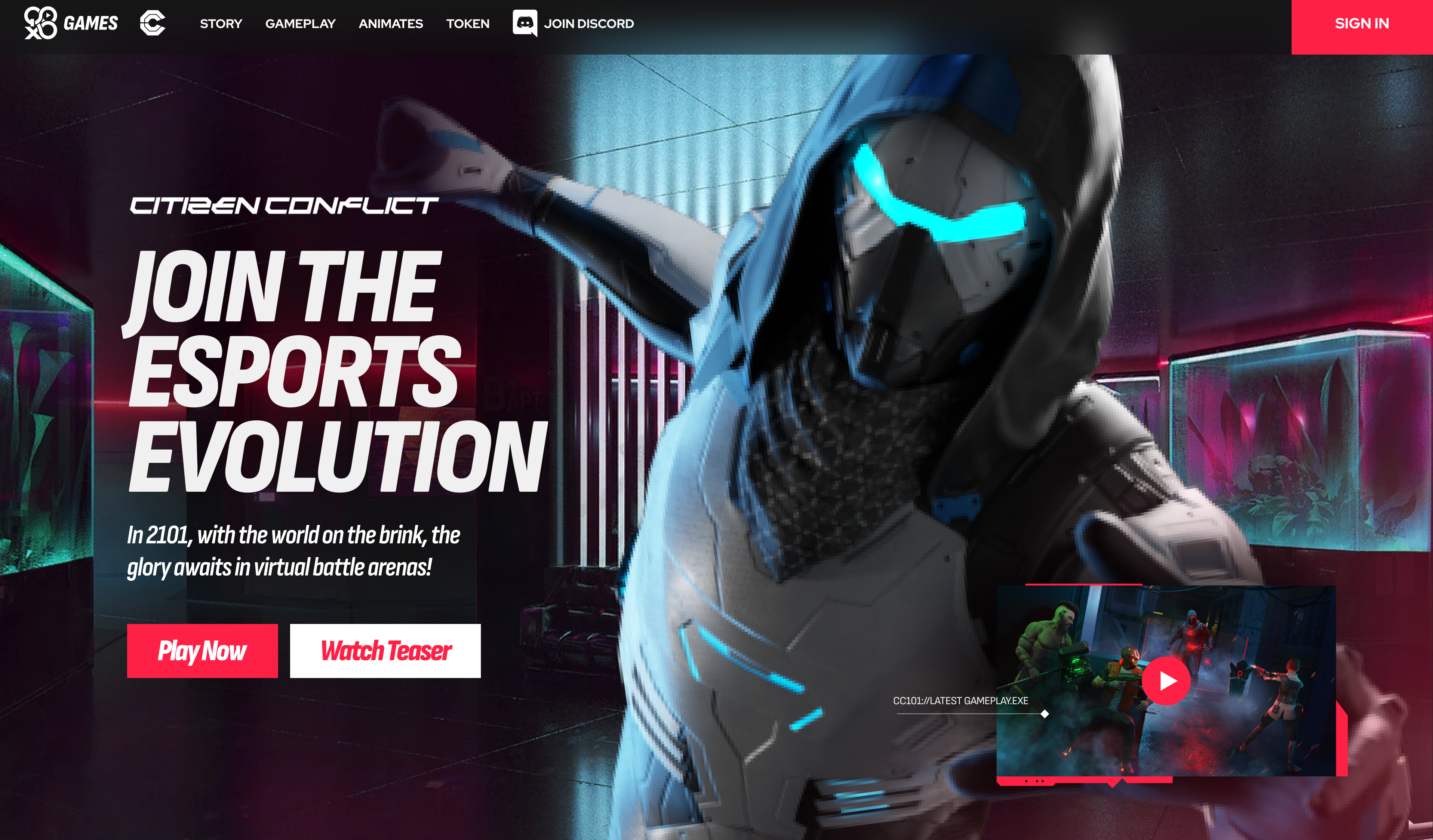
It’s safe to say that in Web2, gaming websites are landing pages funneling users to purchase, Web3 gaming websites serve rather as pitch decks for investors. They are built to sell the entire idea of yet non-existing products. That’s why these websites are packed with fancy 3D animations and interactive elements.
Another reason might be the lack of any monopoly platform akin to Steam or Epic Store. There are countless such projects all across Web3, but none enjoys a substantial user base. Therefore, Web3 users are more inclined to visit the website of respective games rather than one of many gaming platforms.
Speaking of landing pages, what should a convertible, highly persuasive landing page have to get the job done?
First of all, it should be concise and straightforward. It should communicate a single idea the visitors get hooked on. The message should be clear right from the start. Once you have this done, it’s highly individual what converts visitors into players. Someone falls for nice renders, others get in thanks to art style or video embed of gameplay. It depends. But surely, it shouldn’t be overstuffed, unclear, or visually inconsistent.

What are the most common mistakes you notice on websites?
One thing that annoys me, and it can be seen on most of the Web2 game websites, is the formulaic design. You can see it among huge players, such as Ubisoft or EA - it’s always the same layout, nothing that would differentiate the product or catch the attention of visitors. Always the same framework with different images and texts.
Another UX issue I encounter quite often is the outbound links that lead visitors away from the webpage they landed on. Most usually, creators put YouTube embeds at the front of the page to convert visitors through nicely shot trailers. But sometimes, these videos tend to link users to the video source, such as YouTube, and hence, make the user go away from the site. There are thin chances that the visitor will come back, in case the video hasn’t sold him entirely.
Moving on to in-game user experience, what’s the main difference between designing websites or web apps and in-game user interfaces?
Both need to be intuitive for users, in-game interfaces even more so. From the players’ perspective, the website is not the domain you visit daily. Once you play the game, you check on the website for the latest updates or similar minor stuff. On the other hand, if the game UX fails to engage players, they’ll leave. Therefore, it’s critical to put enough thought and consideration into building highly intuitive and engaging interfaces for products that players use daily. On top of that, in-game interfaces can be fun to design, although it can be challenging - maybe also ‘cause of me having a more substantial background in designing websites and apps.
What’s your biggest achievement in UI/UX?
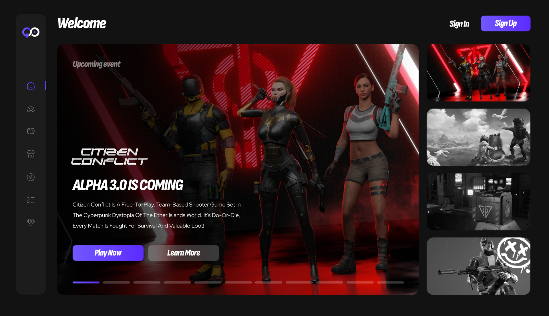
Most probably, the recent unification of the QORPO WORLD ecosystem into a single web app. Quite some time ago, we had all our products on separate domains with different visual identities. Obviously, it didn’t work. We had to reinvent our product direction and unify all of our products under one umbrella with the same brand identity. Now, you can find the NFT marketplace, esports platform, social hub, community voting, games, as well as our home page on one domain in a consistent design. With small breaks, it’s been a long month of work to attain the results.


